
Faberge
Missoma
Swarovski
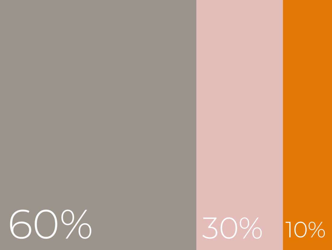
Finding the right colour scheme for your space and your display is essential but we have to admit, it is not always easy. Today we introduce you to the 60|30|10 theory - a timeless design principle that will make your colour pairing almost foolproof.
How does it work?
In order to create visually appealing and well-balanced displays you should work to a combination of…
60% primary colour
30% secondary colour
10% accent colour
The 60|30|10 rule is ideal for those wishing to bring colour into their spaces but do not quite know where to start. Below, our team puts together 3 display themes based on this theory.
How does it work?
In order to create visually appealing and well balanced displays you should work to a combination of…
The 60|30|10 rule is ideal for those wishing to bring colour into their spaces but do not quite know where to start. Below, our team puts together 3 display themes based on this theory.
60% primary colour
30% secondary colour
10% accent colour

The 60|30|10 rule is ideal for those wishing to bring colour into their spaces but do not quite know where to start. Below, our team puts together 3 display themes based on this theory.
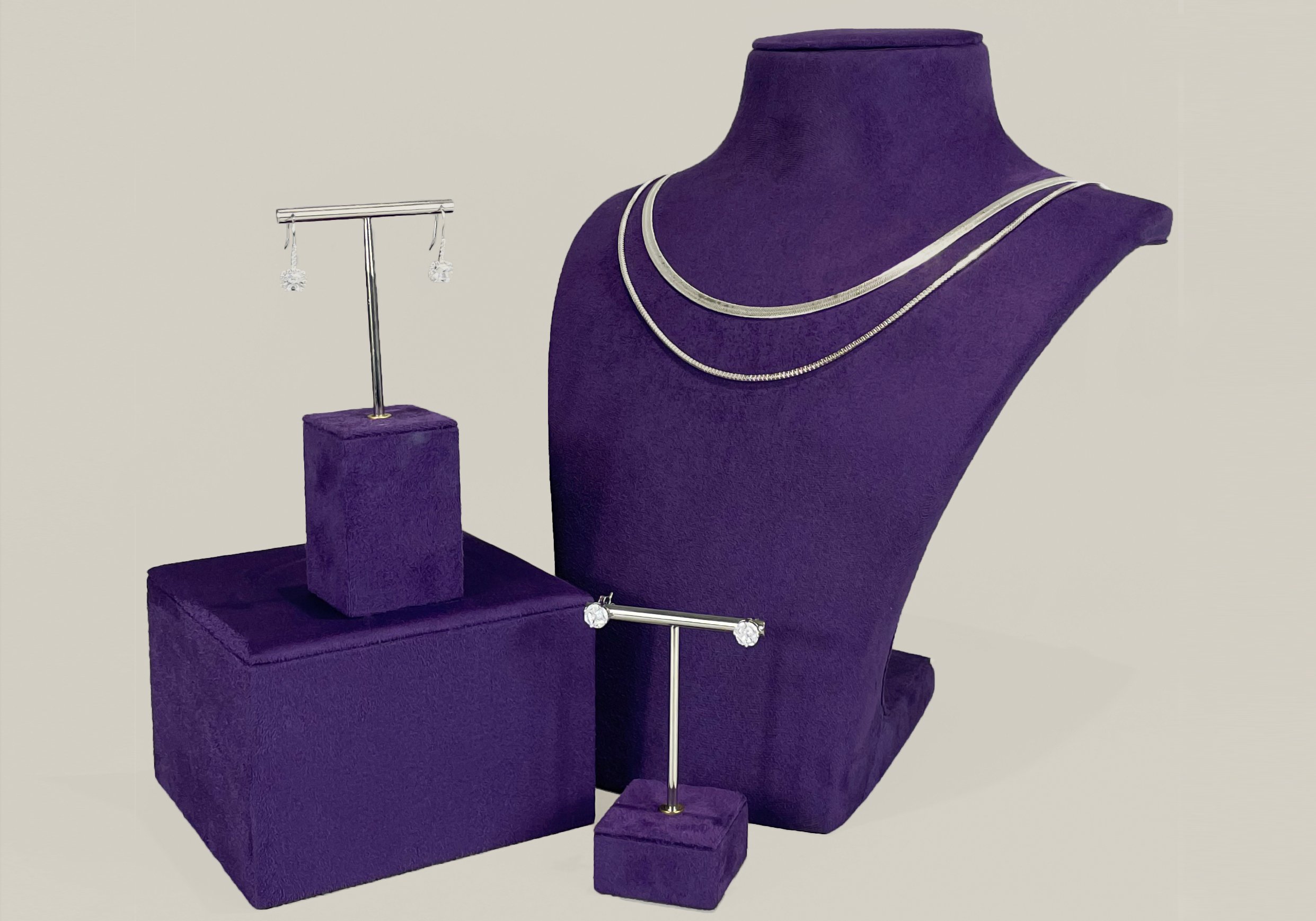
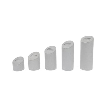
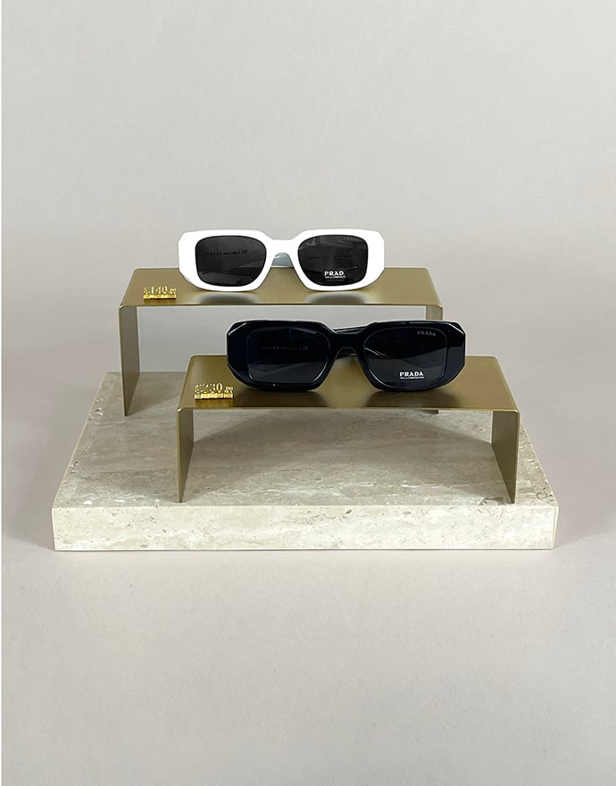
Floral pop
Bright, fun, and bursting with energy.
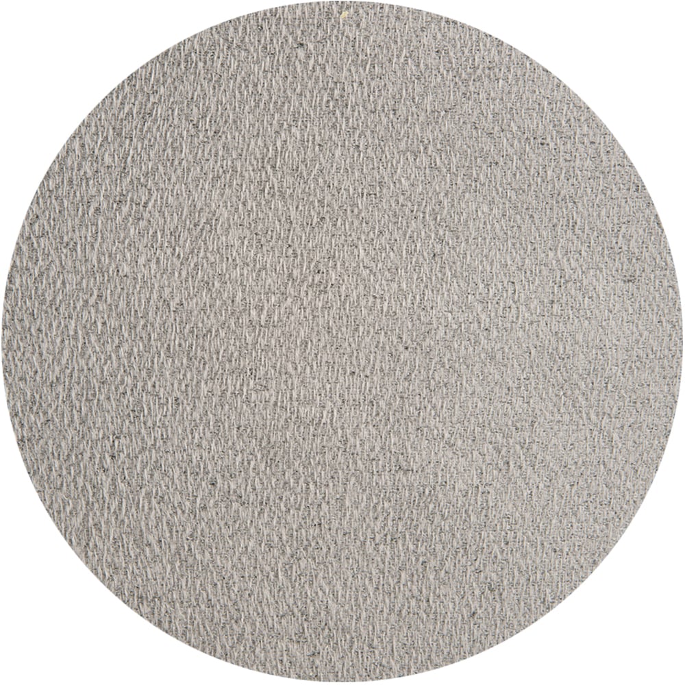
Primary Colour
Light grey
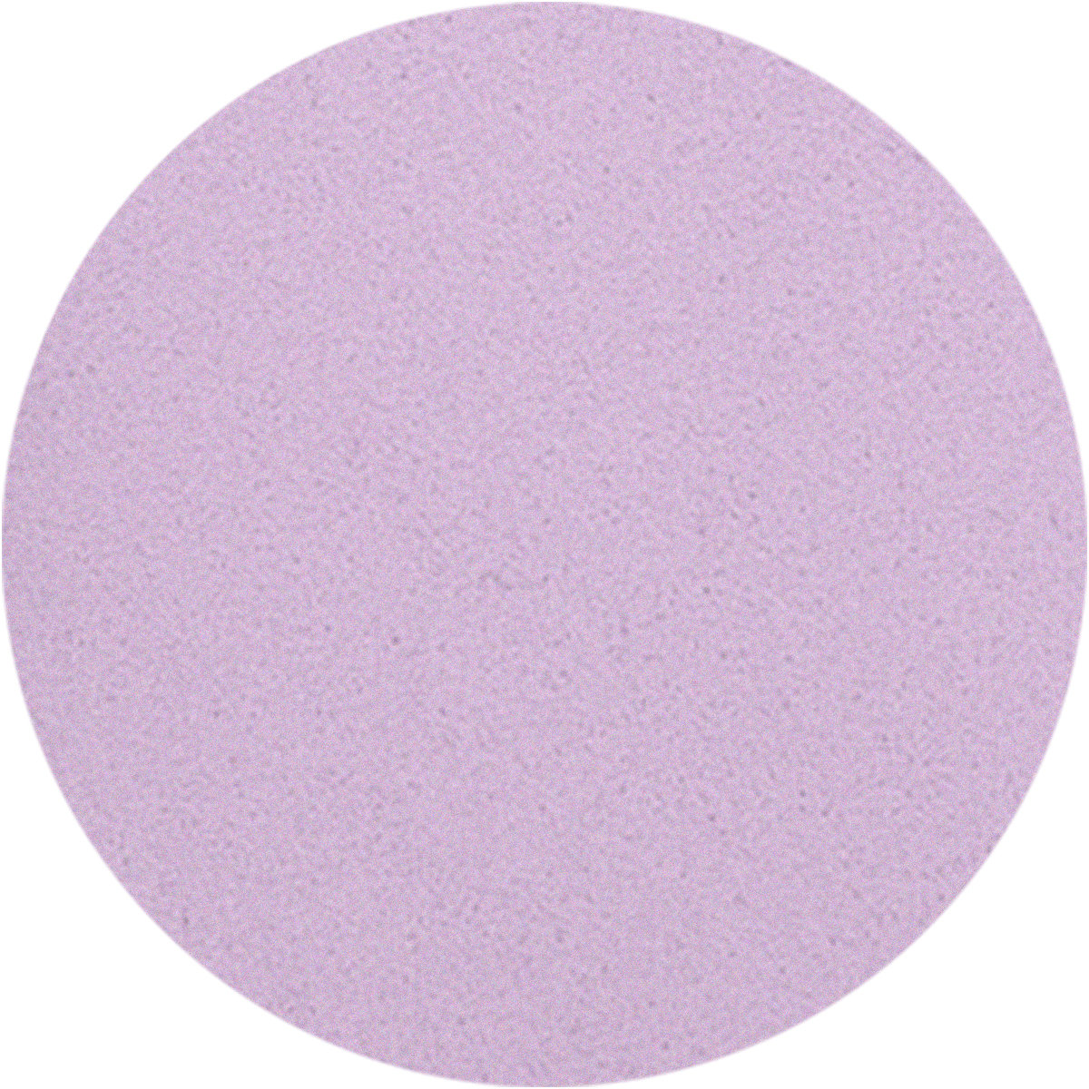
Secondary Colour
Lavender
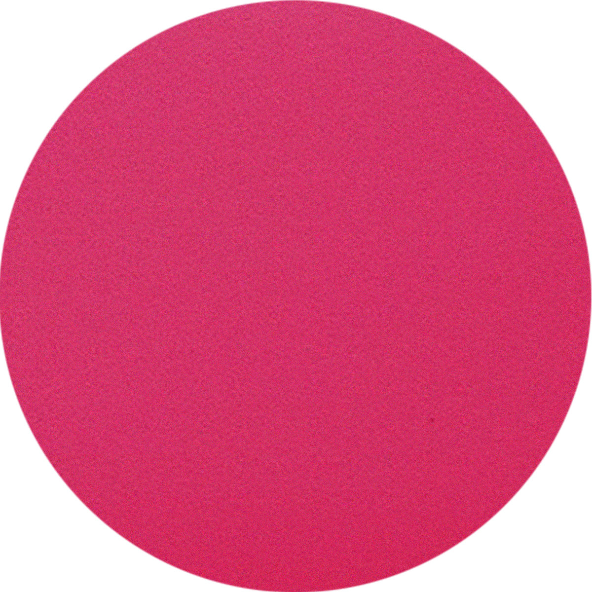
Accent Colour
Fuchsia
Why it works?
Perfect for vibrant gemstones, or playful statement pieces, this theme brings a lively, joyful aesthetic. The combination of cool light grey with vivid pops of fuchsia and lavender creates an eye-catching contrast that feels fresh and inviting.
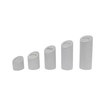
The fuchsia earring stand and bracelet display act as the accent colour, both featuring spherical shapes, creating visual harmony while drawing attention with their distinctive form. This display theme is ideal for easing your display into spring with colours inspired by beautiful blooms.


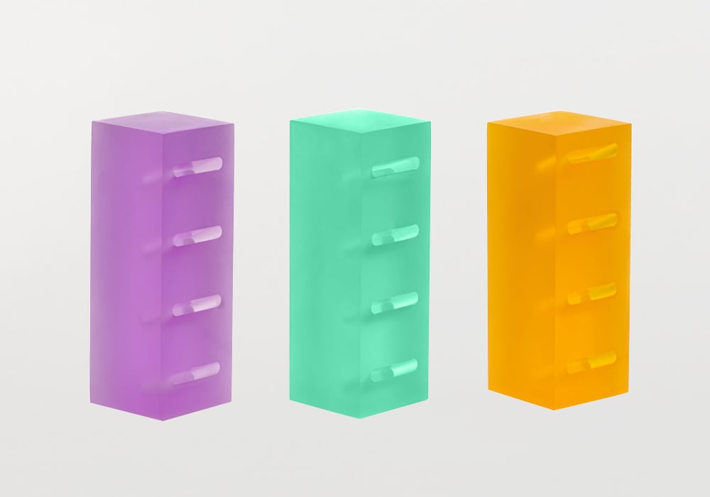
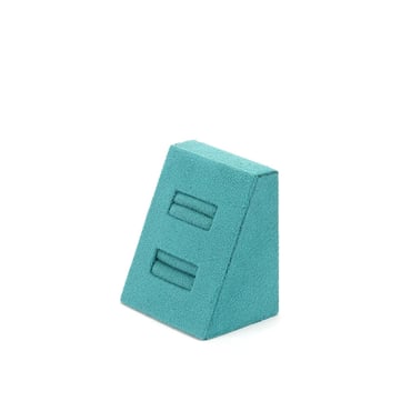
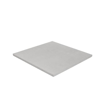
Pastel Dream
Soft, sophisticated, and effortlessly chic.
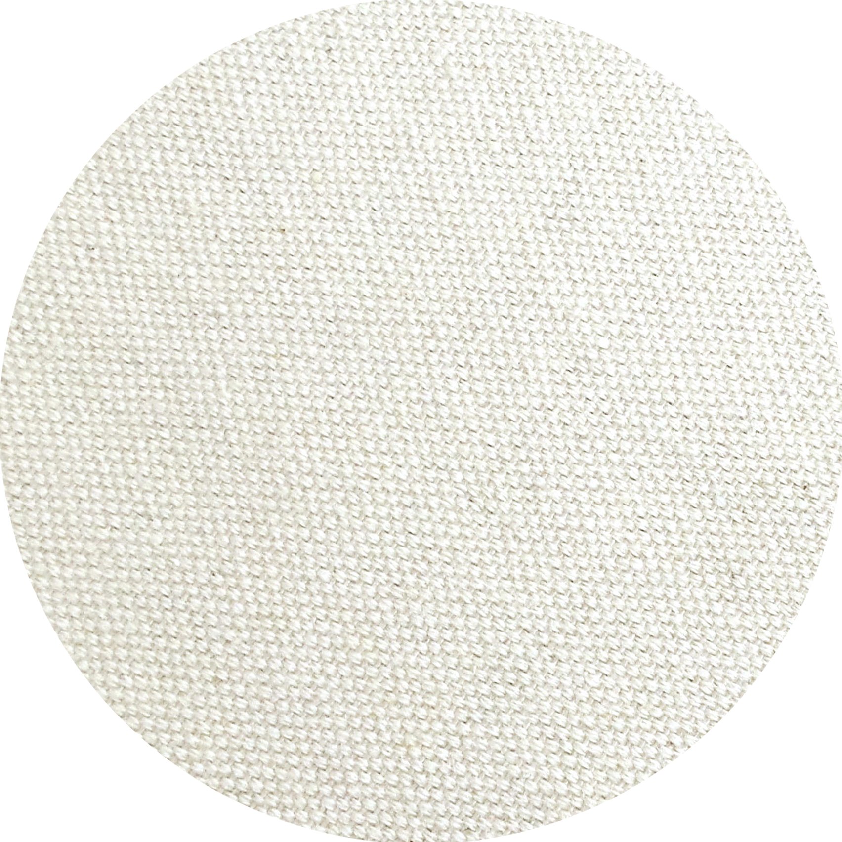
Primary Colour
Linen
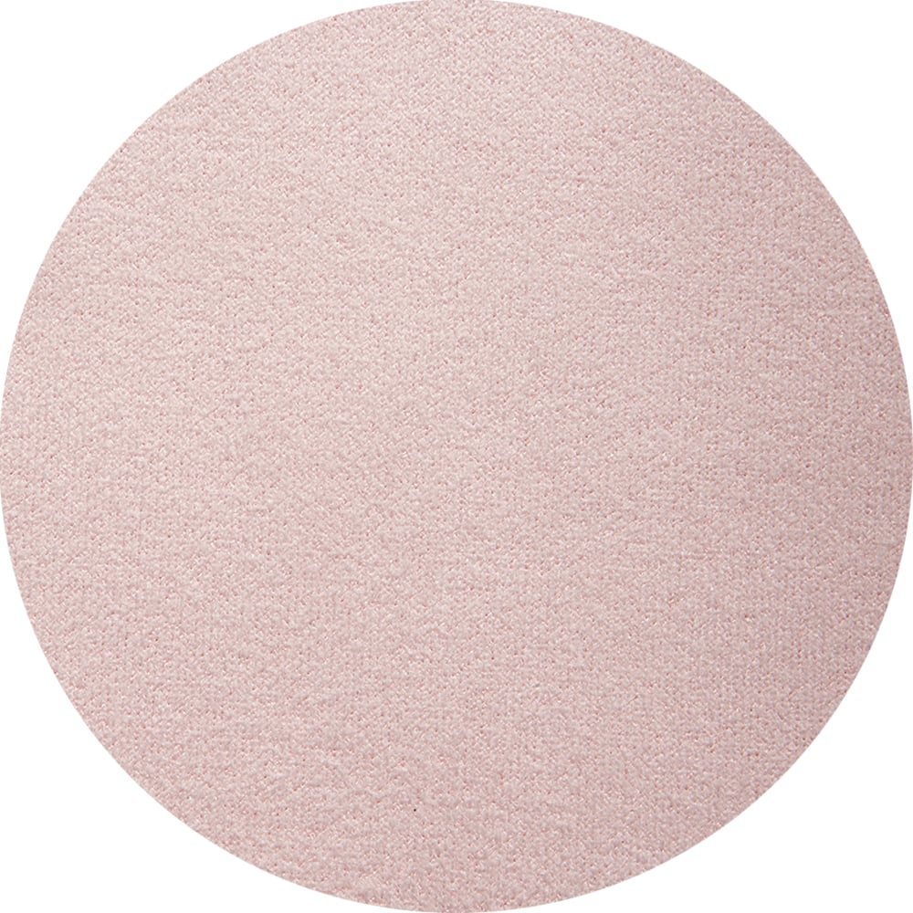
Secondary Colour
Blush Pink
Accent Colour
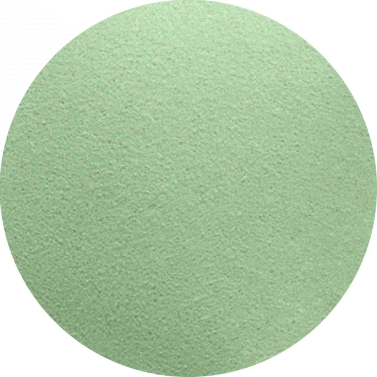
Mint Green
Why it works?
This palette exudes understated elegance, perfect for showcasing fine jewellery, pearls, or delicate gemstone pieces. The neutral linen backdrop ensures the display feels inviting, while blush pink enhances warmth and femininity.
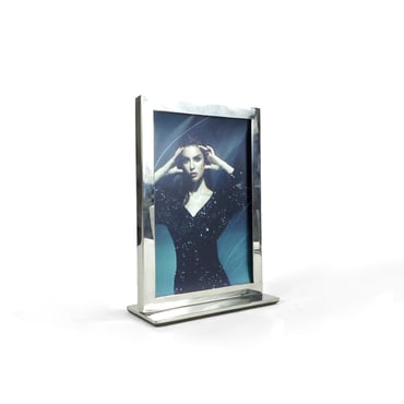
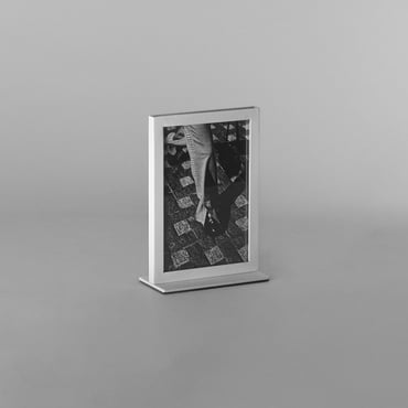
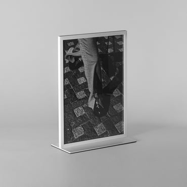
Mint jewellery display stands, used sparingly, act as eye-catching accents, while incorporating POS frames with fabric boards is an excellent way to bring in your main or secondary colours. This jewellery display is perfect for a bridal or Easter collection, evoking a soft, romantic feel.


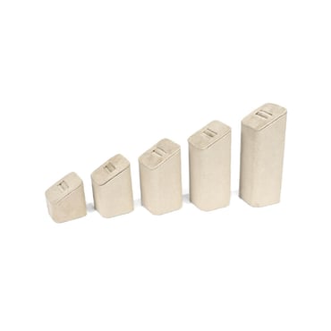
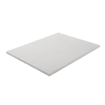
Sunset Serenity
Warm, inviting and beautifully bold
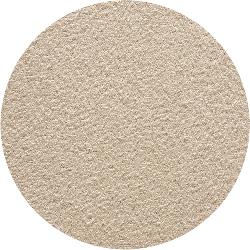
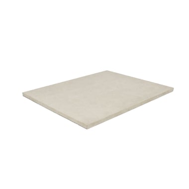
Primary Colour
Natural Suede
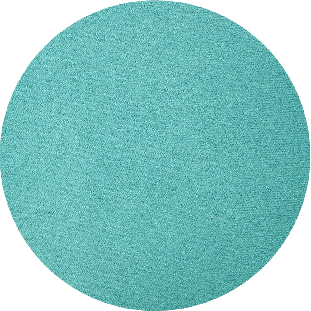
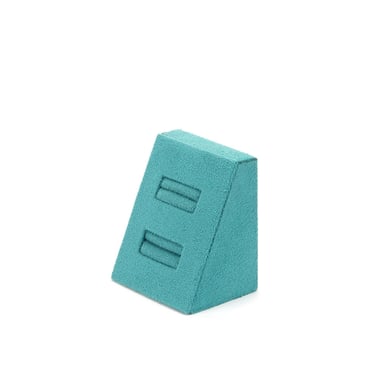
Secondary Colour
Teal
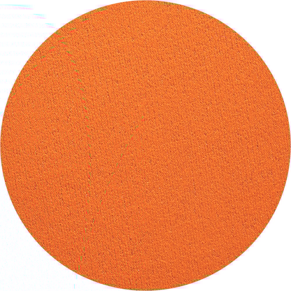
Accent Colour
Orange
Why it works?
A vibrant palette that blends rich sunset hues with a touch of coastal calm. Ring holders and earring stands in natural suede provide a soft backdrop while accents of teal and orange infuse energy and contrast.
A single necklace display stand in vibrant orange serves as the focal point, drawing attention with its bold colour. Perfect for summer, this display setup remains versatile by keeping bold colours to small accents—using a few jewellery stands and display frames with interchangeable fabrics. This makes it easy to refresh your look as the seasons change.


Feeling inspired?
Stores that dazzle.
Boucheron | Dior | Wakefield Jewellers | Swarovski